Minimalism in Design– Understanding Your Scope
With the increasingly connected world we live in, many companies design products to be as versatile as possible. The goal is to widen the user base, including many people from different walks of life. This approach is seen in the products themselves, but especially in the way brands are marketed.
This trend towards broader inclusion is observed alongside the rise of minimalism, and I hypothesize that the two go hand in hand. Companies want their products to be liked and purchased by as many as possible to maximize profits, so they design them to be neutral and non-offensive. Cue the rise of the “sad beige aesthetic”. Any type of bold statement goes out the window, and along with it, a great deal of personality. Character is sacrificed on the altar of aesthetics. But when you try to get everybody to like your product, you give up something that people can love (or hate!).
Let’s observe how this trend has played out with some well-known examples. Recently, Johnson and Johnson rebranded from their 135-year-old logo to a more boring, albeit more legible, option. Under Elon Musk’s acquisition of Twitter, the social media giant “bid adieu to the twitter brand and, gradually, all the birds [1],” becoming instead simply “X”. The iOS 7 release in 2013 marked one of the most significant shifts to a cleaner, more streamlined look, and the trend has continued in the decade since.
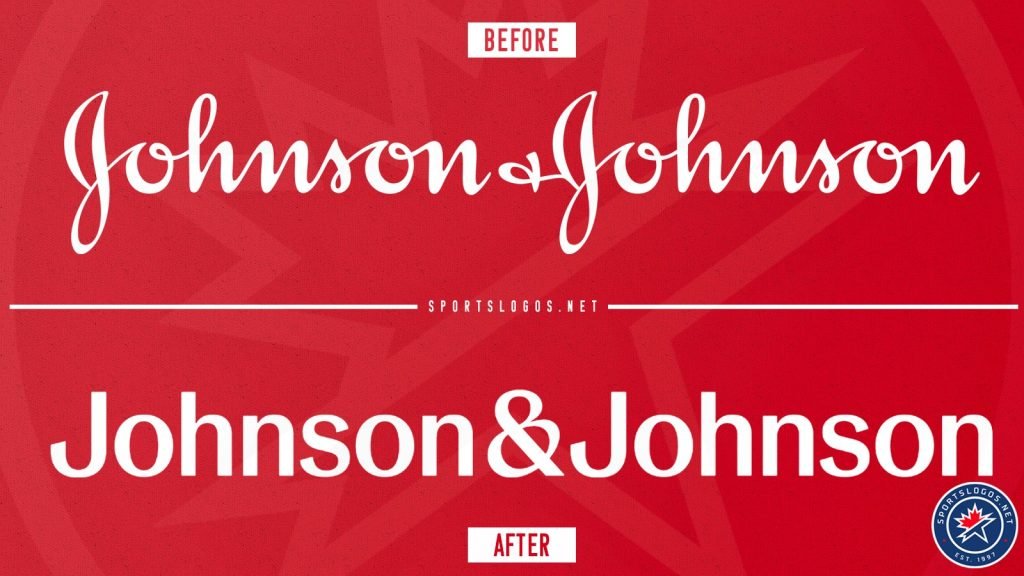
Johnson and Johnson’s rebranding [2]
Now, the clean and simple look of minimalistic design has merit. Popular opinion favors the look in many cases, such as with iOS 7. It can feel decluttered and more professional. Ultimately, the preference between minimalism and maximalism (or anywhere in between) is a personal one, and it can vary case to case. My own preference is probably clear to you by now. Let’s just say that I wasn’t thrilled about Musk’s abandonment of the classic blue bird. Even Marie Kondo stipulated that some excess is permissible if it sparks joy [3].
So what should designers do? Ebb and flow with the trend of the day? Always cater to as many as they possibly can to maximize profits? Designers need to first define their goals– specifically, they must define the scope of their target audience. From there, they can decide on a trade-off between a clean, minimalist look, and a look with a bit more character. This applies to both logos and the products themselves.
Many companies do want to cater to as many people as possible. Common examples include technology companies such as Google or Netflix. Their customers include people from many different backgrounds, ages, and tax brackets. It’s in their best interest to market themselves with a clean, approachable, and extremely likable look. These companies rank amongst the highest grossing companies because they have such a massive customer base and a broad scope.
But some companies will have a smaller scope. Patagonia, for example, creates quality outdoor clothing and gear. Their brand is built on its mission to protect the planet, and they cater to people who prioritize that same goal. They market themselves more towards the outdoorsy, “granola” personality. Patagonia products exhibit a bit more color, and its logo, more character. Their iconic synchilla fleece is known (and loved) for its funky, retro patterns. This style is divisive because it’s so unique. If your goal was to target as many customers as possible, you would never go for such an out-there print. Certainly there are people who hate the funky synchilla patterns, but they are not a part of Patagonia’s audience. And there are more than enough people who love it to keep the company afloat.

The Patagonia Logo [4]
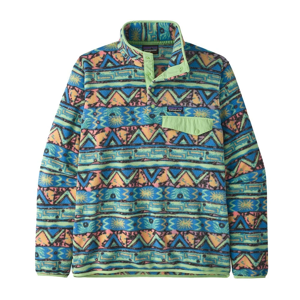
Patagonia Synchilla Fleece [5]
Though their niche is smaller, and their audience more narrow, Patagonia is the very best at what they do. The company brings in $100 million per year [6] (not close to Google, but still hefty) and they were ranked the US’s most reputable company [7].
There are endless examples to point to. Walmart has a very minimalist, appealing logo. They sell just about everything you can think of. The Starbucks logo, featuring a siren, is more less minimalist and more distinctive. They specialize in coffee. This relationship between scope and minimalism doesn’t hold true in every case, but if you observe brands– from grocery stores, to restaurants, to makeup brands, and everything in between– you will definitely notice a pattern: the minimalism in their logos and their products frequently corresponds to their scope. Think about Target, Nike, and Facebook— all companies with a wide customer base. What about Converse, Red Bull, Toblerone, or NASA?
In conclusion, don’t be afraid of a little bit of character. But don’t be afraid of minimalism, either. Neither of these things are inherently good or bad; they just serve different purposes. The only thing you should be afraid of is failing to understand your audience. If you understand your audience, and you understand the scope of that audience, and design accordingly, then you will find success– no matter your personal preferences or the trends of the day.
References:
[1] https://twitter.com/elonmusk/status/1682964919325724673
[2] https://dailybrand.co.zw/johnson-and-johnson-rebrands-introduces-new-logo-after-135-years/
[3] Kondo, Marie, and Emily Woo Zeller. The Life-Changing Magic of Tidying Up: The Japanese Art of Decluttering and Organizing. Unabridged. [United States], Tantor Media, Inc, 2015.
[4] https://1000logos.net/patagonia-logo/
[5] https://www.silverbowflyshop.com/patagonia-lightweight-synchilla-snap-t-fleece-pullover/
[6] https://www.nytimes.com/2022/09/14/climate/patagonia-climate-philanthropy-chouinard.html
[7] https://fortune.com/2023/12/08/patagonia-cop28-most-reputable-us-company/
To cite this article:
White, Natalie. “Minimalism in Design– Understanding Your Scope.” The BYU Design Review, 9 May 2024, https://www.designreview.byu.edu/collections/minimalism-in-design-understanding-your-scope.