Design in Data Figures: Multi-Axis Figures
Note: This is part of series on designing good data figures. See the other articles in the series here, here, here, and here.
Introduction
Ever heard of the Baader-Meinhof Phenomenon? Well, you have now. And, I’m sorry to say, you‘ll start seeing (or thinking about it) all the time. Why? The Baader-Meinhof Phenomenon is the principle that once you learn something or are aware of something you see and hear about it all the time. If you start driving a Honda, you notice Hondas on the road more often than you did before. Did you buy a new jacket? If you have, it might seem like everyone is wearing your jacket now. Think you heard a new song? You’re going to hear it everywhere. It might be stuck in your head right now.
Multi-axis Figures
For me, a few weeks ago I noticed a multi-axis figure and the presenter drove me crazy with the misdirection it caused. Since then, I’ve been seeing multi-axis figures all over the place, and frankly, some of them are really bothering me. This type of data figure doesn’t have to be annoying, but when multi-axis figures are poorly designed the cognitive load can be painful. These are also known as dual-axis figures (if there is only two y-axes), but “multi-axis” is more general and works for dual-axis figures anyway. Usually, they are found with a temporal x-axis but they are found in any situation where two responses or dependent variables have the same independent data. Often, multi-axis figures are used to show correlation(or at least correlated trends) or differences over time and over other categories.
So, without doxing anyone you might know, I’ve chosen a different multi-axis figure that represents a similar problem I saw a few weeks ago (which I can’t unsee in my minds’ eye).
Take a look at this atrocious example:

The above graph is making the viewer work, and work hard! Is the red line for Population on the right y-axis or left y-axis? Is the Members axis on the right or left? Is the data for “Population” always bigger than “Members?” Can you have a population sample of the members? Are those words always what you initially think they mean? I have to think about the semantic definition of those words before I can even start to work on understanding the data. Furthermore, how many lines does your eye have to cut through and cross for certain data points to read off a particular level for both axes? (By the way, what’s with the terrible x-axis?)
Let’s try another one that wasn’t purposely made to be confusing (but definitely is). Which axis is for revenue and which is for the number of travel agents in the following?
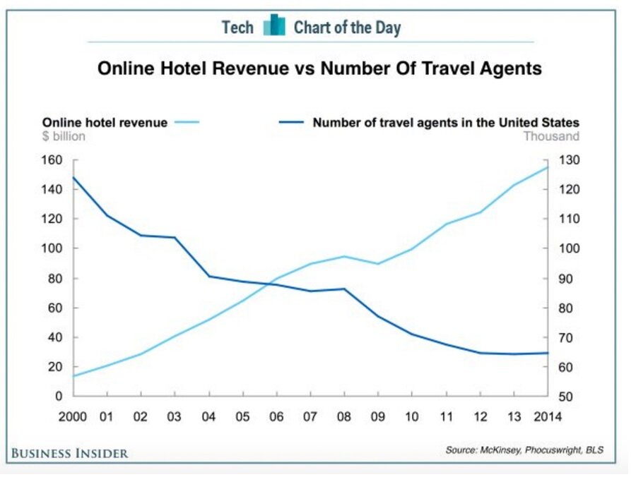
The Left axis and Right axis respectively, correct? Pretty clear… Even that light gray text seems to help with the units. But a problem exists when we look at the top right or top left of the graph. Let’s zoom in and assume someone highlighted the data for 2014 with a big red arrow:

It’s easy to get the blue line and the “Thousand” and the 130 all mixed up. But, in fact, this blue line is for revenue. It doesn’t mean “just under 130,000 travel agents in 2014” despite what your eyes are seeing. Your eyes will have to scan all the way across to the other side and realize that this big red arrow is pointing at 150 billion. It really is, and that’s a problem. It’s even worse for someone with color blindness because the line colors are fairly close.
Also, this is a classic case of mixing absolute and relative scales which can be deceptive, since the bottom of the scale stops at 50 thousand agents. The number of travel agents has dropped by only half in the 14 years even though it looks like more (maybe like 80%). In fact, it also looks like it dropped from 150 to 65 thousand. BUT that’s 150 billion on the left axis. It actually dropped from 125 thousand to 65 thousand over 14 years, which is about half, all on the right axis. Don’t believe me? Take your time and only use the right axis. It’s mentally painful but true.
The ranges of these axes actually span a portion of the same range (i.e.g 50 to 130). Completely different scales (or orders) can help a little (like the population/member example above if the terms were better) but even different ranges can still induce a lot of confusion. Scales should be on different ranges and perhaps even with different units for the labels. If not, you might see something like the following. Try and figure out which data goes with which axis for this graph (hint: there is only one actual temperature per day):

Speaking of color, that is one way to help with these multi-axes figures. Let’s look at this next one:

The axes are all colored with respect to the data line and corresponding marker. What this allows the viewer to do is filter out the non-colors-of-interest when trying to parse this figure. We are less likely to make a mistake with respect to the color and associated axis (assuming we aren’t colorblind) but there are a lot of crossings; crossings of data lines, crossings of axes, crossings of grid lines. The viewer has to consult the legend at the bottom and then back to the axes multiple times to figure out what’s going on.
In some ways, this is three figures that are overlaid on top of each other with different colors. Admittedly, they each have the same x-axis so it may be more efficient in terms of real-estate but it suffers in terms of readability. That’s the trade-off and we should ask ourselves which one is more important. Yes, there might be some correlations and causations that this figure is suggesting, and positioning the data on top of each other might help identify those relationships but a more palatable way to present these data exists.
Now that we’ve looked at some failures, what are some good principles for the design of multi-axis figures? Consider the following:
Label the legend the same as the axes. Don’t mix names, use synonyms, or abridge titles (if possible). Try to keep acronyms to a minimum.
Consider a mixture of lines and bars to exaggerate the differences even more than two or more lines.
Use a unit symbol in the axis tick labels if possible (e.g. $, degF, mm) to subtly remind viewers of the differences.
Try to have vastly different scales to reduce the chances of mixing up ranges.
Use colors for the axes if you can but regardless, check the visibility of your color choice for colorblindness here.
Set-up the axes so that the viewers’ eyes don’t have to pan around and cross other elements continually.
Lastly, consider dropping the multi-axis entirely and just have two single-axis figures stacked on top of each other, with the same x-axis. Together, they can be surprisingly clear to a reader without sacrificing any storytelling capability.
This example from DataHero does a pretty good job. Take a look. (Although the light/dark color contrast between the green and orange should be higher).

This one also does a good job with the different scales, colors, and a clear legend. (The legend and labels are a little different since the legend had to be condensed in its current location.) The x-axis on the top is also a nice feature so the eye doesn’t have to cut through lots of data for triangulation.

Practice makes Perfect
Time for you to practice. Take a look at the following examples and see if you can find the good thing and bad things in each of the designs of these multi-axis figures.
Whether you practice or not with the following examples, I guarantee you’ll start seeing these multi-axis figures everywhere because of the Baader-Meinhof Phenomenon. However, hopefully, you’ll only see well-designed figures in your own presentations. After all, an essential component in good design is communicating to others your great work. That last thing you want is a buyer, investor, or professor confused about what you’re presenting.


To cite this article:
Salmon, John. “Design in Data Figures: Multi-Axis Figures.” The BYU Design Review, 22 Mar. 2021, https://www.designreview.byu.edu/collections/design-in-data-figures-multi-axis-figures.