Design in Data Figures: Absolute Versus Relative Scales
Introduction
You’ve likely heard that 90% of all statistics are made up - just like the one in this sentence. Statistics and data are valuable but only when they are accurate and truthful. Some historians call the current state of the world “the Information Age” which replaced the Industrial Age a few decades ago. During this age of the computer, internet, and smartphone technology, information and data are valued so highly that corporations take extreme measures to protect it and will litigate when data is stolen, abused, or misappropriated.
Without sufficient data, the decisions based on them can be disastrous. Yes, we sometimes, or even often, have to make decisions under uncertainty, when all the data and their analysis is unavailable, but we should try to present and consume the best data possible along with the best data representations possible.
You might have also wondered why the exact same data can cause people to draw significantly different conclusions. Discussions about cognitive biases, correlation vs causation, statistical paradoxes, and a host of other interesting phenomena keep data scientists and many researchers debating, reviewing, and revising interpretations, results, and conclusions. Although the facts may be unchanging, how we present these facts and data to others has a real influence on how they might reach different conclusions that are necessary for real-world decisions. Do you differ in opinion from at least one person you know that has the same background, education, environment, parents, etc.? The answer is probably yes.
As engineers and designers, we also need to carefully scrutinize the data sources and visualizations that we use and create to convince others of our analysis, prototypes, or evaluations are correct and desirable.
At least one common way the same data can be presented but cause opposing conclusions in viewers is through mixing up absolute and relative scales on figures.
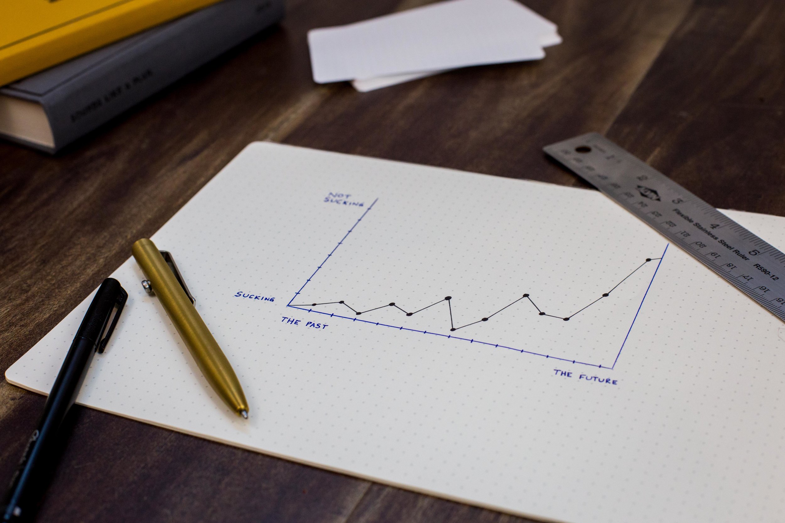
Example
Let’s start by looking at the following two figures:
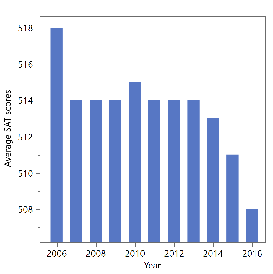

These figures show the exact same data of the average student SAT scores (only for the math portion) for the USA during the years of 2006 to 2016.
If the figure on the left was presented to you in isolation, you might have cause for concern. Not only does it appear that scores have drastically dropped from 2006 to 2016 but the scores really have dropped. If you are a high-school teacher, a school district administrator, a secondary school educator, a director of some state education board, a parent, a CEO of an SAT preparation company, or many other roles, would you be panicking after seeing this data? Should we all be concerned? Are we failing the next generation of students? Are teachers slacking off? Are students just more lazy? Are they wasting their time on smartphones? Are we falling behind other countries? Do we need more tax dollars in education? Are we doomed to a future of despair? (Okay, that escalated quickly to a major problem.)
But now, take a minute and notice that these data are presented on a relative scale. The y-axis starts at scores around 506, and all the other bars have lengths with respect to, or relative to, this bottom point. Thus, although at first glance it looks like student performance is a fifth of what SAT scores were in 2006, the y-axis shows that indeed the average SAT scores have only dropped 10 points during those 11 years, which is about 2% (assuming a linear relationship at this point in the range).
Now, what if you were given the figure on the right in isolation. You might notice that the bars all look about the same height and all end a little above 500. There appears to be some fluctuation but overall, there’s nothing really exciting. The data looks pretty stable and doesn’t provide any real evidence that we should be overly concerned especially when more important issues are ongoing throughout the world. True, some might notice that collectively we look stagnant and that these values would be better if they were going up over time, but generally, most people would call this figure fairly bland and wouldn’t be sharing it on social media and causing anyone to lose sleep or take action. The y-axis, of course, is on an absolute scale, starting at 0 and ending at 600.
This example and these data could be the trigger of causing two people to reach completely opposing conclusions. Looking only at the left figure, one person might start to think that the future is indeed bleak, students are failing miserably, and the US will never recover from this decade of disaster. They may want to double down on funding our schools, propose drastic policy changes, and run for office on an education platform. Looking only at the right figure, a different person might see nothing to worry about in these same scores, perhaps even feel pride that our education system is continuing to maintain good standards, and will pay attention to something else clearly more important. If these two people were in a conversation with access to nothing but their respective relative and absolute scales of this identical data, they might disagree on the problem, its severity, how to respond, and many other things. The exact same data would divide them because of a scale. Maybe this seems like a small thing to you but facts, data, and information is a really big deal right now in the world, and the presentation of data inadequately could be part of the problem.
Other Examples
What’s important to take away from the above example is that absolute and relative scales can be both used (and abused) to further one’s agenda, defends one’s position, or convince a buyer, investor, or customer to make the purchase. Interestingly, neither one is completely bad or completely good. Both are useful but both can be misused. Someone might want you to think a problem is bigger than it is, or smaller than it is. Unfortunately, either scale can be used by either side of an issue to present data to support their own perspective. Name any big issue you’re currently aware of: climate change, income inequality, racial violence, government corruption, etc. and you can find charts that will present the same data in different ways to support the presenter’s position.
In some cases, these scales are adjusted to be percentages so that the denominator is further obfuscated from the analysis. Try to be critical thinkers when these types of data claims are found verbally or in visualizations.
Some examples:
“80% of doctors who use this brand recommend it” (How many doctors use it though? 5?)
“I doubled my performance” (Yes, but you were only able to do one pushup before.)
“A town grew by 1000% in the last 10 years” (Sounds amazing until one realizes the town started with 20 people)
“It’s only a 1% increase in taxes” (A percent can be harder to mentally process compared to a speaker specifying it was a $15 billion tax increase)
Now test out your newly identified skills and take a look at these three examples. How could the scale be used for or against a particular opinion? Does an absolute scale make sense? Why or why not? Should relative scale be used? Why or why not?


http://www.childcareservices.org/wp-content/uploads/2014/09/WorkforceReport_2012.pdf
Conclusion
In terms of engineering design, it’s always a good idea to ask yourself what scale is appropriate to compare different designs, their features, or their performance across the variety of metrics on figures when communicating to your audience. For example, a 10 psi difference may or may not be relevant to show when analyzing the design of some pressure tank. It could be in the noise or it could be a very significant value compared to some benchmark. Selecting the correct type of scale in these situations will be necessary to emphasize what’s important without deception. Likewise, engineers will need to properly ascertain if presenting their own design as very different from their competitor’s design (using relative scales) or similar to their competition (using absolute scales). Both can be effective but both can misrepresent or complicate design decisions without properly clarifying or addressing, or underscoring the chosen scale.
Similarly, be careful not to hide an issue using the wrong scale, since that can be dangerous, but also be careful about exaggerating or, on the other hand, suppressing an effect, difference, or trend that is essential for correct decision making. We are permitted and encouraged to accentuate the positive, the benefits, the advantages but not if they don’t actually exist and not if it leads to deceiving our audience. Err on the side of full transparency, and in some cases, both absolute and relative scales can be used concurrently.
To cite this article:
Salmon, John. “Design in Data Figures: Absolute Versus Relative Scales.” The BYU Design Review, 10 Jun. 2020, https://www.designreview.byu.edu/collections/design-in-data-figures-absolute-versus-relative-scales.