Design in Christmas Movies: Elf and the Forced Perspective
Every year in December, I’ll watch a couple of Christmas movies with my family. If I’ve seen the movie before, I like to put my designer’s hat on and think about various design elements of different aspects of the movie plot, features, or special effects. Previously I’ve discussed Home Alone and How the Grinch Stole Christmas.
This year, I watched ELF with my two youngest children, ages 8 and 10. It was their first time watching this movie and they loved it. There are some great moments and my children were laughing hysterically at Buddy, played by Will Ferrell, who is a human raised by Christmas elves trying to reconnect with his real father in New York City. Buddy’s extreme passion for Christmas, with a healthy dose of naivete about anything in the real world, is a cheerful way to start the Christmas Season.
Of course, I was most pleased with their questions at the end such as “How did they make Buddy so big compared to all the other Elves?” In the movie, Buddy is always presented much bigger than all the Christmas elves in the scenes at the North Pole.
The director, Jon Favreau, and his team wanted to minimize the use of computer graphics throughout the movie for necessary effects which includes the technique to make Buddy look bigger compared to real-sized actors who were playing the roles of elves.
The best way for that is through Forced Perspective.
Forced perspective is nothing more than placing the camera at a particular location and angle to make objects in the frame look smaller or larger with respect to each other. The result is often a humorous juxtaposition of objects that don’t often go together or can’t exist in real life. In other examples, far objects appear to be closer but smaller, or close objects look farther but are just miniature versions of something that could be far in the distance. Zach King uses forced perspective in many of his videos and almost everyone visiting the leaning tower of Pisa will take a forced perspective shot like this one:
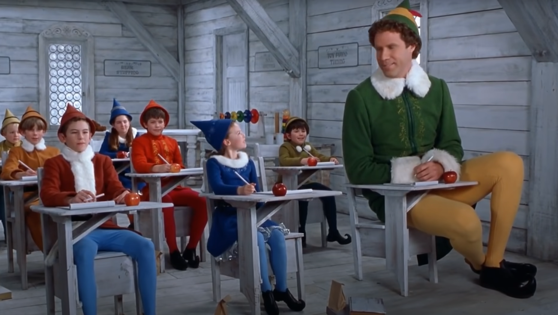
Regardless, forced perspective can really mess with our brains and trick them into thinking that a bunch of elves are smaller than they really are. In one scene in Elf, Buddy is attending school with a bunch of elf students. (See below: This, and all following figures, are screenshots taken from: https://www.youtube.com/watch?v=rYPJYxEoPCg )
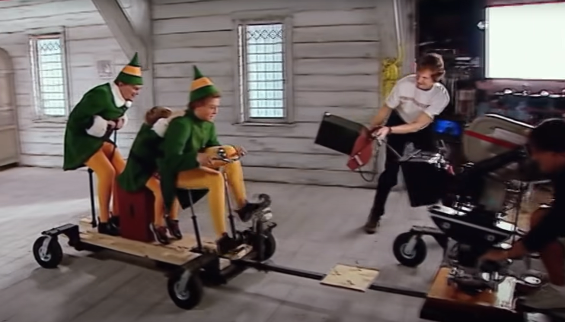
The neat thing about this shot is that the desk Buddy is sitting in is very small. In the real world it’s much smaller than all the other desks, but the angle of the camera makes it look the same size as the other elf children’s. To complete this effect, Buddy is actually positioned 8 or 10 feet in front of the rest of the students. He’s not really looking at the girl in blue and she’s looking behind him, but together the forced perspective makes it looks real. Take a look at the real-world setup below:
Now that you know that Buddy is sitting in a small desk on a table, you can just barely make out the back of the table in the earlier picture. It aligns with the floor boards fantastically well. I give the designers (and the actors!) a solid A-plus for this forced perspective effect.
Another flashback scene is one of Buddy’s birthday riding a bike with his adopted Papa Elf. Bob Newhart, who play’s Papa Elf, is larger than the boy actor playing a young Buddy, but Papa Elf looks much smaller due to forced perspective and positioning Newhart many feet behind young Buddy.
Of course, his real hands can’t reach that far forward and are too big compared to Buddy so the producers hired a second child actor for just his hands to be placed on the shoulders. The effect is pretty neat and the engineering design that enable it is even more neat. Take a look:
You will notice that the camera man was rigidly connected to that very specific point to maintain the forced perspective during the forward motion and movement throughout the shot. Without maintaining this constraint, the forced perspective would only look believable at an instance in time and not for the full few seconds necessary for the scene.
The last example comes from another scene with Papa Elf where Will Ferrell’s character, Buddy, sits on the lap of Bob Newhart.
Papa Elf is again positioned much farther away to make it appear as if he’s smaller than he really is. His legs though are provided by another kid actor, who really does have smaller legs and thus can be in the foreground. Lest you are concerned for the kid actor having the weight of a grown Will Ferrell sitting on him, there were supporting chairs, seats, and a diving board for the actors. It looks quite real in the movie and only upon close inspection of the picture above can you notice the space and a slightly hovering Buddy.
Good design is harder to spot than bad design. Everyone will notice the bad design and the frustrations or ridiculousness that it can cause, but good design can feel so natural one can mistakenly think it was always there. In the movie Elf, the application and techniques of forced perspective is good design and feels natural - perhaps even more so than the computer-generated flying Santa sled scenes later in the movie.
To their credit, the props designers and production team took many hours to make carts, desks, tables, and chairs to enable the wonderfully successful forced perspective scenes when Buddy is interacting with Santa’s elves. I consider that time to be time well spent. Although we only see these angles and shots for perhaps just a few seconds at a time, those few seconds add up tremendously to the magic throughout the movie.
I’m not a believer in elves but I am for those 1.5 hours during the movie. That’s good design.
To cite this article:
Salmon, John. “Design in Christmas Movies: Elf and the Forced Perspective.” The BYU Design Review, 13 Dec. 2021, https://www.designreview.byu.edu/collections/design-in-christmas-movies-elf-and-the-forced-perspective.


