I Can’t Look Away From the Design of Trash Cans!
If I thought it was unlikely to write an article about garbage cans, I thought it was even more unlikely that I would write two articles on garbage cans. But here we are and I now have more designs of garbage cans to share and discuss.
I was fortunate to join a group of students on a study abroad recently. We visited companies and toured various design and art museums throughout Italy and Sweden. Since my most recent article for the BYU Design Review was on the design of garbage cans in Brazil, in a relatively small city called Itacoatiara, I started noticing garbage cans in Europe.
Before long I was taking pictures of these garbage cans when I found an interesting one with a unique look, feature, or aesthetic.
This first one was found near the Roman Colosseum. There were quite a few garbage cans around to match the large number of tourists in the area (which is always a good thing). After all, the last thing we want is insufficient garbage disposal locations around an amazing ancient site and visitors starting to abandon their trash on the ground in frustration. Also, similar to some garbage cans in Brazil, these cans had gaps so both the tourists and the maintenance crew could quickly see if the transparent bag was full. A maintenance crew employee could quickly scan the area and identify which garbage cans are full and whose bags needed to be retrieved. It’s more efficient than walking over there to check, and it’s less wasteful because they can use the full capacity of the plastic bag each time.
For the tourists, if we see a full garbage can from a distance, we may simply choose to discard our trash at another garbage can slightly further away but which is not full (assuming there are enough of them around). In my home country, I’ve personally had to balance my trash at the pinnacle of a huge mountain of garbage that was stacked above an overfilled trash can. I tried to shove down the garbage into the bag but it was futile. I felt badly for the maintenance crew who would have to clean that up later. Clearly this area needed more cans and perhaps see through ports with clear bags so people (and crew) could respond accordingly.
The one bad part of this design was the large number of recyclable plastic bottles that were destined to be trashed. A second compartment dedicated to recyclables and attached to the garbage can could have made it better. These two joined receptacles with different purposes are quite common elsewhere in Rome but unfortunately were not in this exact location.
This next one caught my eye because of the location over the vent. I wasn’t sure if that was by design to help carry the smell and disperse the aroma but it got me wondering if ventilation systems or rain/water drainage systems could double up as a way to aerate the local environment. I also appreciated the substantial locking mechanism for the bag at the top. We all have had that experience when a bag wouldn’t stay attached to the top of garbage can because it was either too big or too small for the plastic bag. This locking mechanism covers about 90% of the lip. That bag is not going anywhere. Finally, I give some IQ points to the worker who left 6 inches dangling from the top below the locking mechanism. There are few things worse than overfilling a bag and then having to pour some into a second bag. With this design margin, the worker might still be able to use the excess plastic even if tourists overfill the garbage can itself.
These next two garbage cans were on tables in a restaurant. Before I saw these, I had to admit that I’m not always sure where to leave my used paper napkin after paying the bill and leaving the tip. I generally just crumple it up onto my plate. However, these little garbage cans on the table leave no room for confusion. I felt like I was helping the waiters clean off our table a little more quickly too.
The following garbage can is close to the traditional one we might think of when playing Pictionary or sketching something out quickly. It’s been modernized and does look cool, although it doesn’t have holes through which we could see the contents inside the bag. In contrast to the cans at the Colosseum, not being able to see could also be a good thing. Do we want to see garbage in bags while walking down the street? This was in a less touristy area of Sweden so perhaps it doesn’t need the visible reminders to anyone, including workers, that the bag is full. Perhaps, unlike the Roman Colosseum, it doesn’t fill up with trash in a day or two and emptying it out is on a less frequent schedule. What I thought was interesting was the reduced hole size at the top - almost as if the designers were asked to constrain the size or shape of trash that was going to be disposed of. More than once I’ve also seen where someone abused a trash can and placed items that were much too large or heavy for a bag to hold and for a maintenance worker to extract (e.g. tires, shelves, and a bike?). There are other ways of disposing of large ticket items and into a street garbage can is not one of them.
This one is also quite traditional, but I took this picture for the lid handle. It’s a good design feature. The garbage can itself is small and moveable, has a lid and side handles, but the extended lid handle on the left felt cleaner when I used it. Without this lid handle I would have had to grab the lid directly. Since the lid is in contact with the plastic bag, and likely some residue from people throwing their trash will build up on parts of the bag, operating this lid handle felt much more sanitary. Yes, I’m aware that door knobs and handles are some of the dirtiest things in public, but at least the perception was established with this trash can that cleanliness is important (and maybe the local workers wiped the handle down a few times each day too).
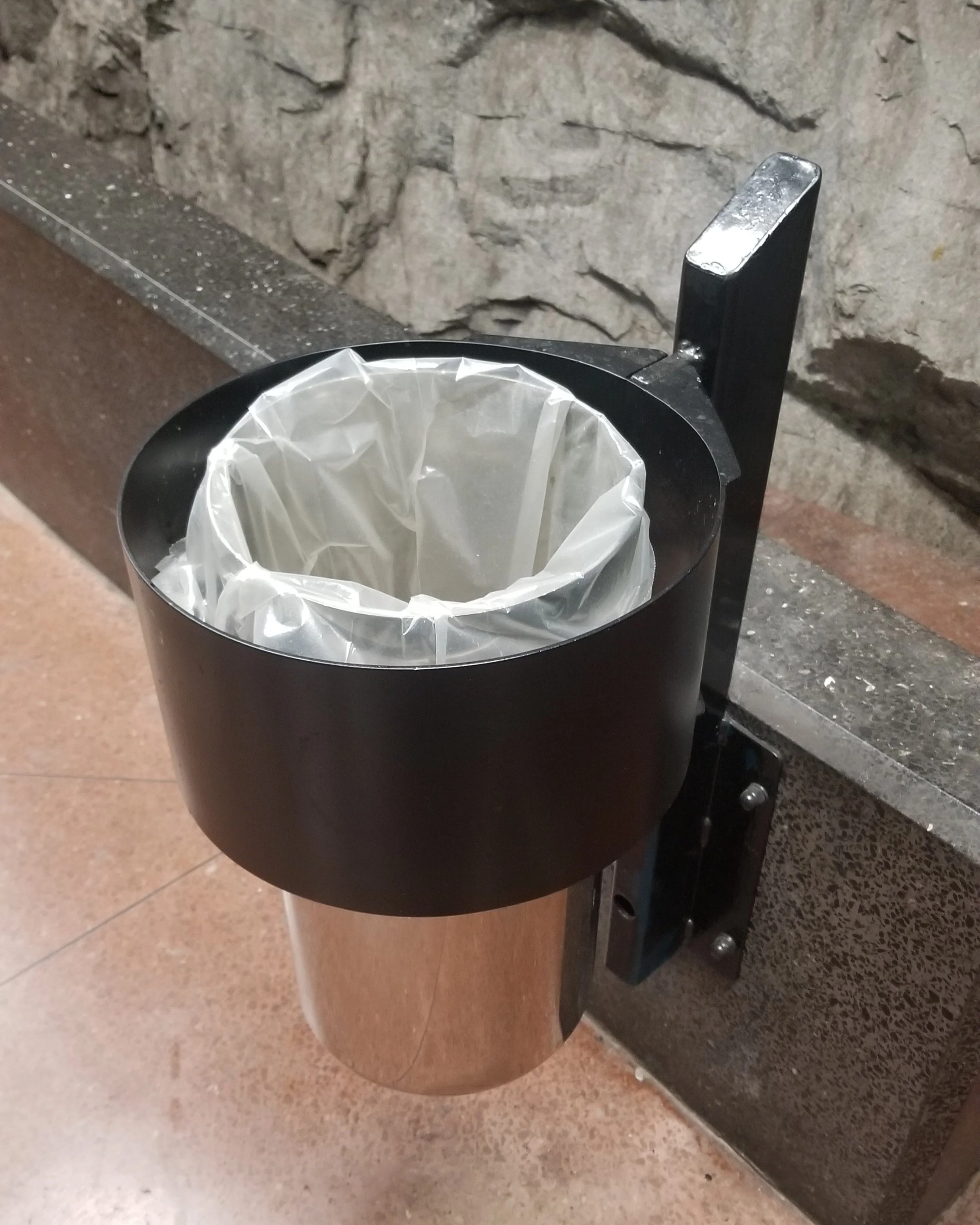
The next garbage can, below, was found in the Stockholm metro system. It doesn’t have a mechanism to clamp the bag down but it does have a guard so that if someone accidently bumps into it they aren’t immediately spending the next five minutes cleaning up trash and missing their train (or walking away in disgust). I also like the support connection to the wall, which allows the sweepers and floor-waxers access to the ground without undue complications.
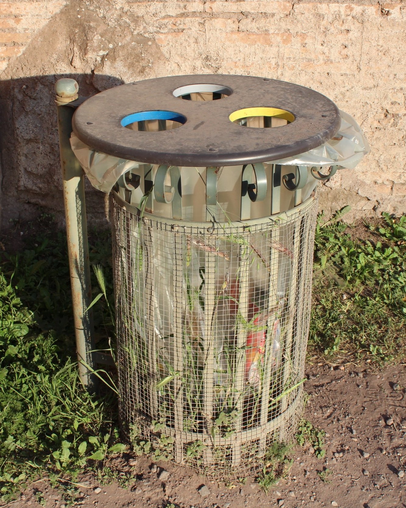
I spotted this trash near the Roman Forum and in particular up on Palatine Hill. At first glance I thought the three colored holes were for different types of trash items, like plastic, paper, and other for example. I was wrong. They all just dump into the same bag. Perhaps the holes constrain the size of the trash as previously discussed, and the clear bags and gaps in the container were good, as mentioned before, but I was again disappointed that the three holes weren’t really functional in any way. True, it was a little more exciting and aesthetically pleasing than a boring large hole at the top, but because my expectations were not met, I left disappointed. I think there is a lesson in that for all of us.
This last one was found on the rooftop of St. Peter’s Basilica. The Basilica is beautiful and if you have a chance to visit Rome, take the time to climb the stairs and see it. I was surprised, to be honest, that there was a trash can at the top. But what I loved was that it matched the statues, architecture, and overall aesthetic in that environment. It was heavy, appeared ancient, and generally fit in very nicely. This trash can was there if one needed it but it also wasn’t an eye sore and distracting from the beauty of the Basilica. I don’t think the Pope or any Cardinal is too concerned with the look of trash cans in the Vatican. But at least one tourist, me, appreciated the efforts of a designer who knew that if just one person cared about their design of a garbage can, it would be cool. And it was cool.
To cite this article:
Salmon, John. “I Can’t Look Away From the Design of Trash Cans!” The BYU Design Review, 8 Jun. 2022, https://www.designreview.byu.edu/collections/i-cant-look-away-from-the-design-of-trash-cans.


