Dieter Rams: Less but Better
“Although design is largely concerned with the future and what we’ll design it to be, it’s valuable to look to the past for inspiration and to quickly learn what might have taken decades for our predecessors to learn. This article looks back at one of the 20th century’s great designers and a few of his most notable lessons.”
Dieter Rams
German product designer Dieter Rams (b. 1932) was formally trained in architecture at the Wiesbaden School of Art in Germany. After graduating with honors in 1953, he was hired as a junior architect for a Frankfurt-based firm [1]. After two years at the firm, a colleague noticed a job advertisement in a newspaper looking for an in-house architect, and dared Rams to apply [2]. Neither Rams nor his colleague had heard of the company. It was Braun.
Rams was hired by Braun as an architect and interior designer to reimagine the company’s workspace. By 1956 he transitioned to designing consumer products for Braun, where after just one year he is widely credited with making Braun a household name. Ultimately, he was head of design for Braun from 1961 until 1995, when he retired [1].
Dieter Rams, 1975
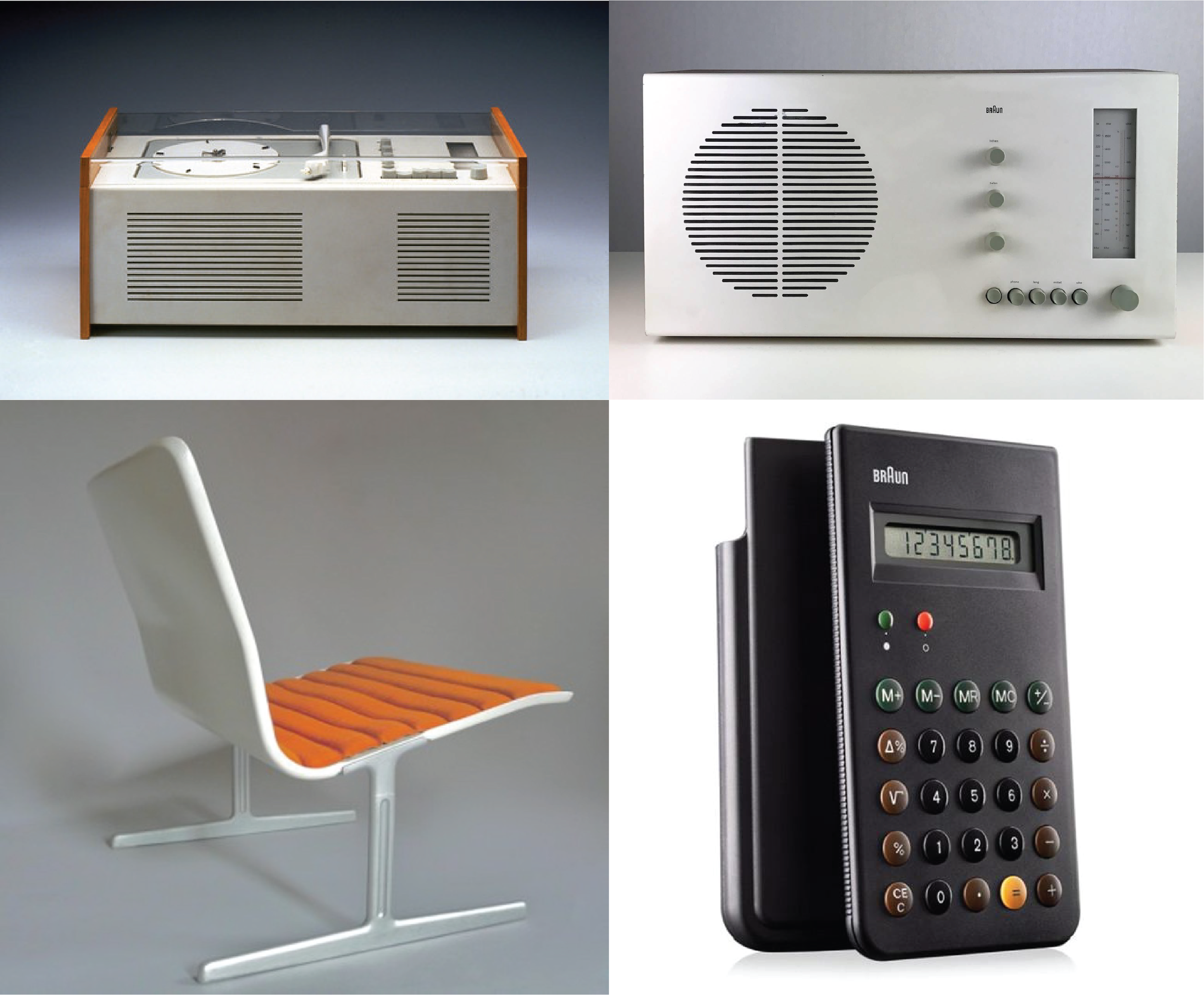
A few of my favorite Dieter Rams designs. Clockwise from top left: Braun SK4 Record Player (1956), Braun RT 20 Radio (1961), Braun ET 66 calculator (1987), Vitsœ 601 Easy Chair (1960).
Interestingly in 1959 he was given permission from Erwin Braun to pursue a parallel career designing furniture for Vitsœ – because in Braun’s words “it will help us sell more radios.” Rams continues to work with Vitsœ today [3].
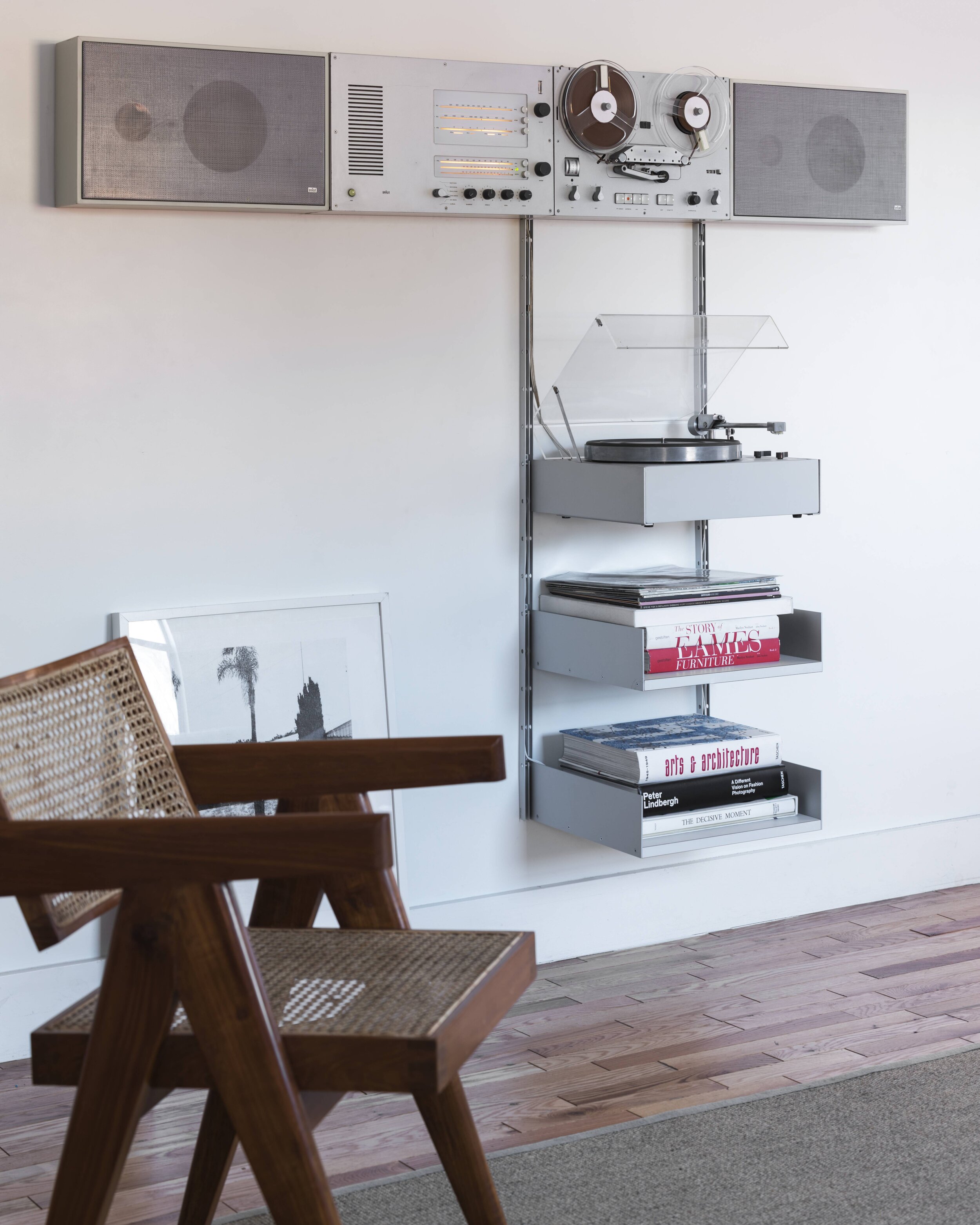
An early interior design sketch (1955) by Rams showing initial concepts for modular wall storage units, in the background [3]. The Vitsœ 606 Universal Shelving System, in production since 1960, originated from those ideas and is shown on the right.
Integrated Braun-Vitsœ system.
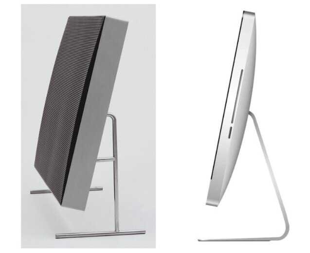
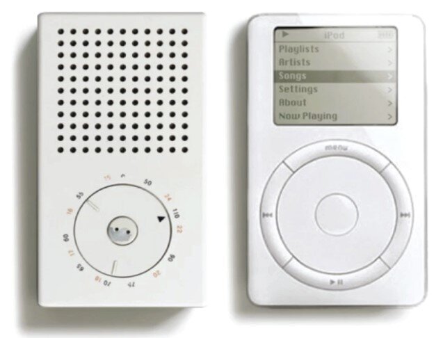
Many modern-day designers describe Dieter Rams as influential to their work, including famed Apple product designer Jonny Ive [4]. The image below shows a sampling of Braun products on the left and Apple products on the right.
How Dieter Rams has Influenced Me
When I first became interested in engineering design, I was driven by the thrill of creating clever things, the challenge of making something work in a particular way, and the uncertainty of trying to design things people like. Those things are exciting for sure and still give me motivation; however, I’ve since learned from Dieter Rams that there’s an additional set of challenges that are also important. Those challenges center around what our designed products do to society and, ultimately, what makes them good for society.
To get you thinking about this other side of the design problem more deeply, I’ve simply put two lists in the last part of this article. They are both lists produced by Dieter Rams’ – verbatim. The first is his most referenced guide to understand what good design is, while the second is a deeper, more complicated, set of questions design teams should ask themselves while designing.
10 Principles of Good Design
In the 1970’s and 80’s Rams formulated a set of principles that describe his approach to design and the values that drive his work [2]. Rams introduces the 10 principles of good design in the following way; “Some fundamental reflections on the – all things considered – essence of design… [is] summed up in ten simple statements… . They are a helpful means for orientation and understanding. They are not binding. Good design is in a constant state of redevelopment – just like culture and technology” [1]. The following are his words.
1. Good design is innovative
The possibilities for innovation are not, by any means, exhausted. Technological development is always offering new opportunities for innovative design. But innovative design always develops in tandem with innovative technology and can never be an end in itself.
2. Good design makes a product useful
A product is bought to be used. It has to satisfy certain criteria, not only functional, but also psychological and aesthetic. Good design emphasizes the usefulness of a product whilst disregarding anything that could possibly detract from it.
3. Good design is aesthetic
The aesthetic quality of a product is integral to its usefulness because products we use every day affect our person and our well-being. But well-executed objects can be beautiful.
4. Good design makes a product understandable
It clarifies the product’s structure. Better still, it can make the product talk. At best it is self-explanatory.
5. Good design is honest
It does not make a product more innovative, powerful or valuable than it really is. It does not attempt to manipulate the consumer with promises that cannot be kept.
6. Good design is unobtrusive
Products fulfilling a purpose are like tools. They are neither decorative objects nor works of art. Their design should therefore be neutral and restrained, to leave room for the user’s self-expression.
7. Good design is long-lasting
It avoids being fashionable and therefore never appears antiquated. Unlike fashionable design, it lasts many years – even in today’s throwaway society.
8. Good design is thorough down to the last detail
Nothing must be arbitrary or left to chance. Care and accuracy in the design process show respect toward the consumer.
9. Good design is environmentally friendly
Good design makes an important contribution to the preservation of the environment. It conserves resources and minimizes physical and visual pollution throughout the lifecycle of the product.
10. Good design is as little design as possible
Less but better – because it concentrated on the essential aspects, and the products are not burdened with inessentials. Back to purity, back to simplicity!
15 Questions Design Teams Should Ask Themselves
The tenth principle of good design is a phrase Rams is most known for. Sophie Lovell, a design historian, said that as little design as possible means “that a well-designed product should be so good that it is barely noticeable. By omitting the unnecessary, says Rams, the essential factors come to the fore: the product becomes ‘quiet, pleasing, comprehensible and long-lasting.’ However to arrive at products with this quality the designer has to travel a very long and difficult path filled with questions, trials, discussion and experimentation.” [1]
Rams outlined 15 questions a design team should ask themselves about the product they’re designing in order to produce a well-designed result. These are his questions.
The first question is not if one should be designing something but how.
Is the product that we are designing really necessary? Are there not already other, similar tried and tested appliances that people have got used to and are good and functional? Is innovation in this instance really necessary?
Will it really enrich people’s lives or does it just appeal to their covetousness, possessiveness or ideas of status? Or does it wake desire because it is offering something new?
Is it conceived for the short- or long-term, does it just help increase the speed of the cycle of throwaway goods or does it help to slow it down?
Can it be simply repaired or does it rely on an expensive customer service facility? Can it in fact be repaired at all or is the whole appliance rendered redundant when just one part of it breaks?
Does it exhibit fashionable, and therefore aesthetically short-lived, design elements?
Does it help people or incapacitate them? Does it make them more free or more dependent?
Is it so accomplished and perfect that it perhaps incapacitates or humiliates you?
Which previous human activity does it replace and can that really be called progress?
What possibilities for change, what scope does the product offer people?
Can the product be used in other, perhaps playful, ways?
Does the product really offer convenience or does it encourage passivity?
What does the expected improvement look like in the broader context?
Does it make an action or activity on the whole more complicated or simpler; is it easy to operate or do you have to learn how to use it?
Does it arouse curiosity and the imagination? Does it encourage desire to use it, understand it and even to change it?
Now what?
Whenever I look into the past, or study about someone else’s design philosophy, I like to pay attention to what resonates with me personally. I like to consider what parts of someone else's philosophy I will integrate into my own philosophy. I like to make a mental note of things I will try, or try to avoid, as I move forward in my own career. Of all the lessons Rams taught, the two lists above resonate with me the most, and within those lists particular principles or questions resonate more with me. Those are the things I’ll hang on to. If you haven’t done it already, I recommend simply rereading the two lists above, and deciding which parts you’ll hang on to.
Inspirational Videos about Dieter Rams
References
[1] Sophie Lovell, Dieter Rams: As Little Design as Possible, 2011, Phaidon
[2] Alice Rawsthorn, “How Dieter Rams Made Braun Look Cool,” 2011, New York Times. https://www.nytimes.com/2011/06/06/arts/design/how-dieter-rams-made-braun-an-it-brand.html
[2] Museum of Modern Art, Dieter Rams Collection: https://www.moma.org/artists/8451#works
[3] Vitsœ Company, https://www.vitsoe.com/us/about/dieter-rams
[4] Jony Ive, Wikipedia. https://en.wikipedia.org/wiki/Jony_Ive
To cite this article:
Mattson, Chris. “Dieter Rams: Less but Better.” The BYU Design Review, 27 May 2020, https://www.designreview.byu.edu/collections/dieter-rams-less-but-better.


![An early interior design sketch (1955) by Rams showing initial concepts for modular wall storage units, in the background [3]. The Vitsœ 606 Universal Shelving System, in production since 1960, originated from those ideas and is shown on the right.](https://images.squarespace-cdn.com/content/v1/5d6700e799e03b0001e82f2b/1590622906702-G5N6JJGB47SG3OMJYZKQ/wallunit.png)


